Config EU
Figma's Digital Conference
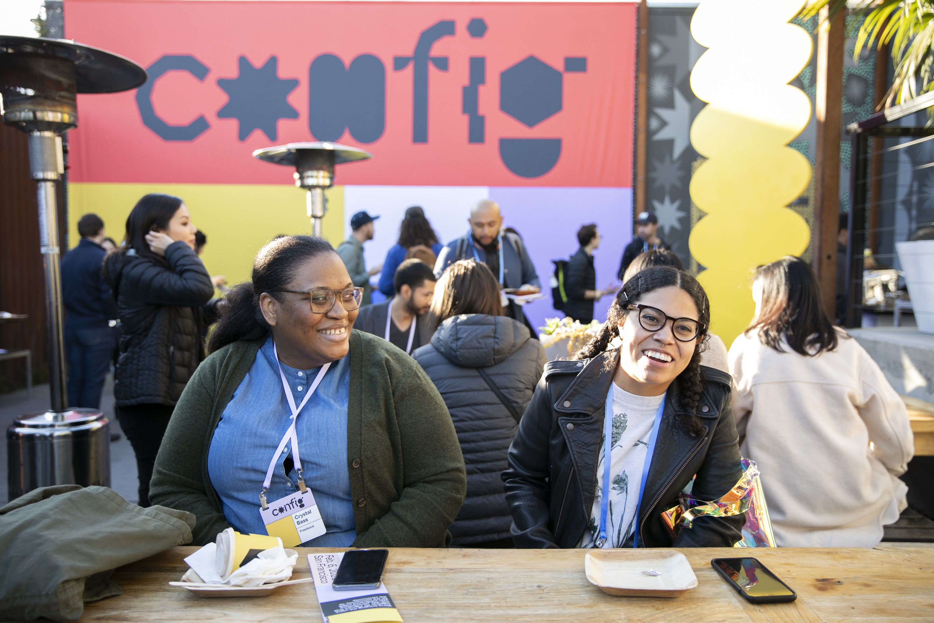
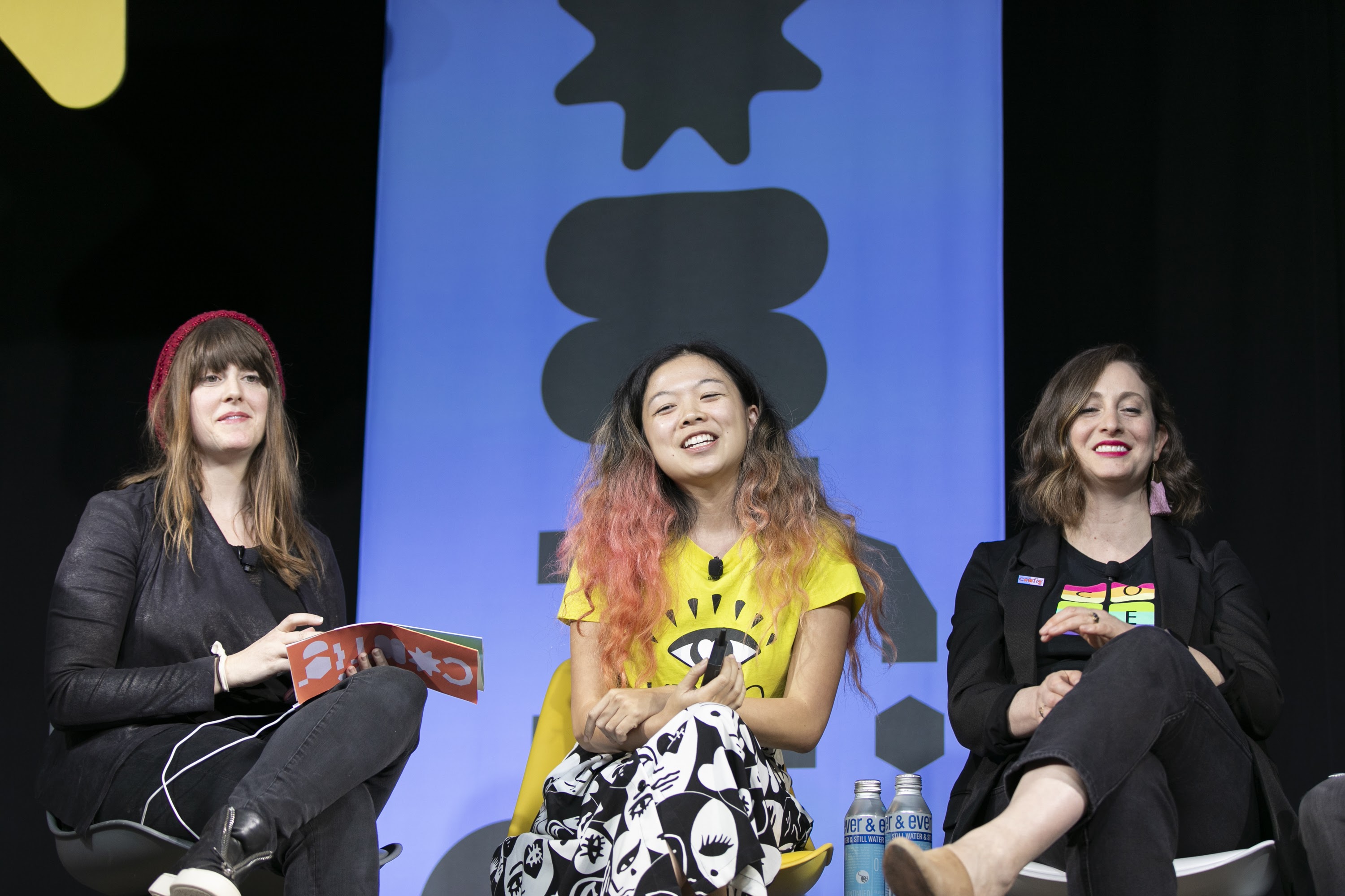
Config is Figma’s annual design conference where users come together to learn from each other.
Last year February, we rented space and held it in person. You can expect a great lineup of speakers, opportunities to network with other attendees, space to ask your burning Figma questions, and to connect with people from around the world. It’s a great time, and I say that as someone who’s not a big fan of tech conferences.
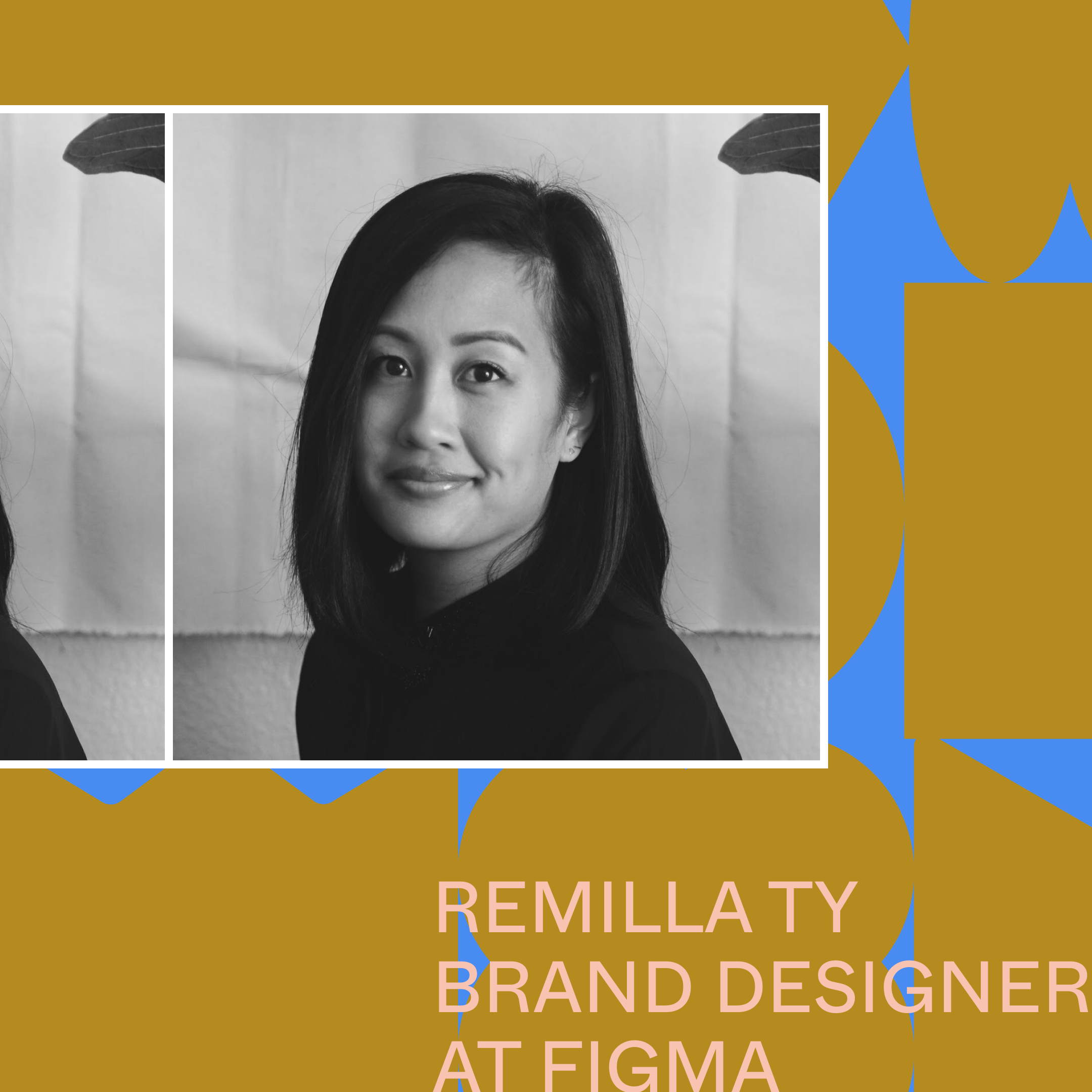
Anyway, the brand team was in charge of coming up with the visual brand for this one and so we did just that. Working with Remilla Ty (senior brand designer) and Tori Hinn (creative director), we mood boarded, researched, conceived, iterated, and landed here.
Config 2020
The first visual branding for Config was done by an agency, with some involvement from the brand team. The idea behind it centered around modular moving parts made of shapes that spoke to continuous construction and evolution of improving, learning, and growing as a community. That was a long sentence to read, I know.
TLDR: Figma’s main brand uses shapes, shapes represent the community (which is a big part of Figma’s existence, and the modular system is the many configurations of us together.


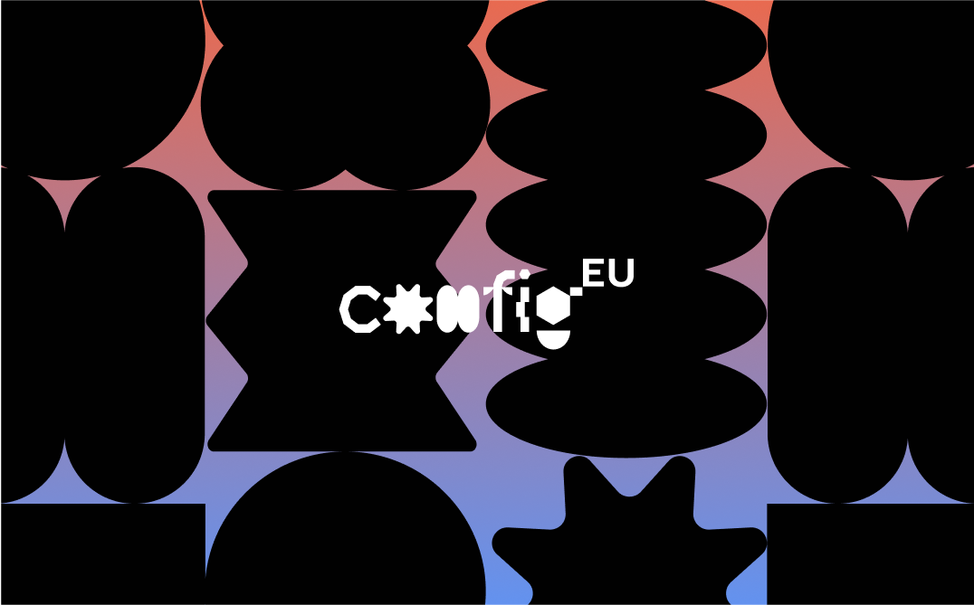
Config EU
Config EU was designed by the brand team at Figma, with me taking the lead.
We carried the visual language over from the main one and developed a system for its EMEA counterpart, which is Europe/Middle-East/Africa which we shortened to EU because that’s where Figma’s newest office was opening up.
Moodboard
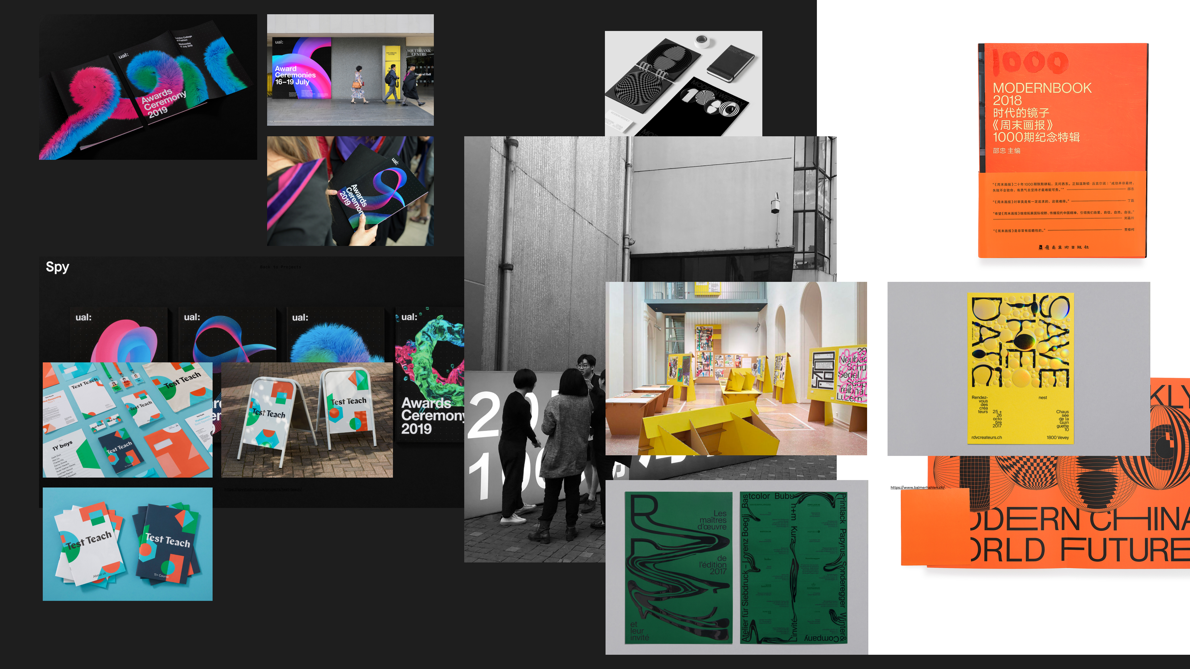
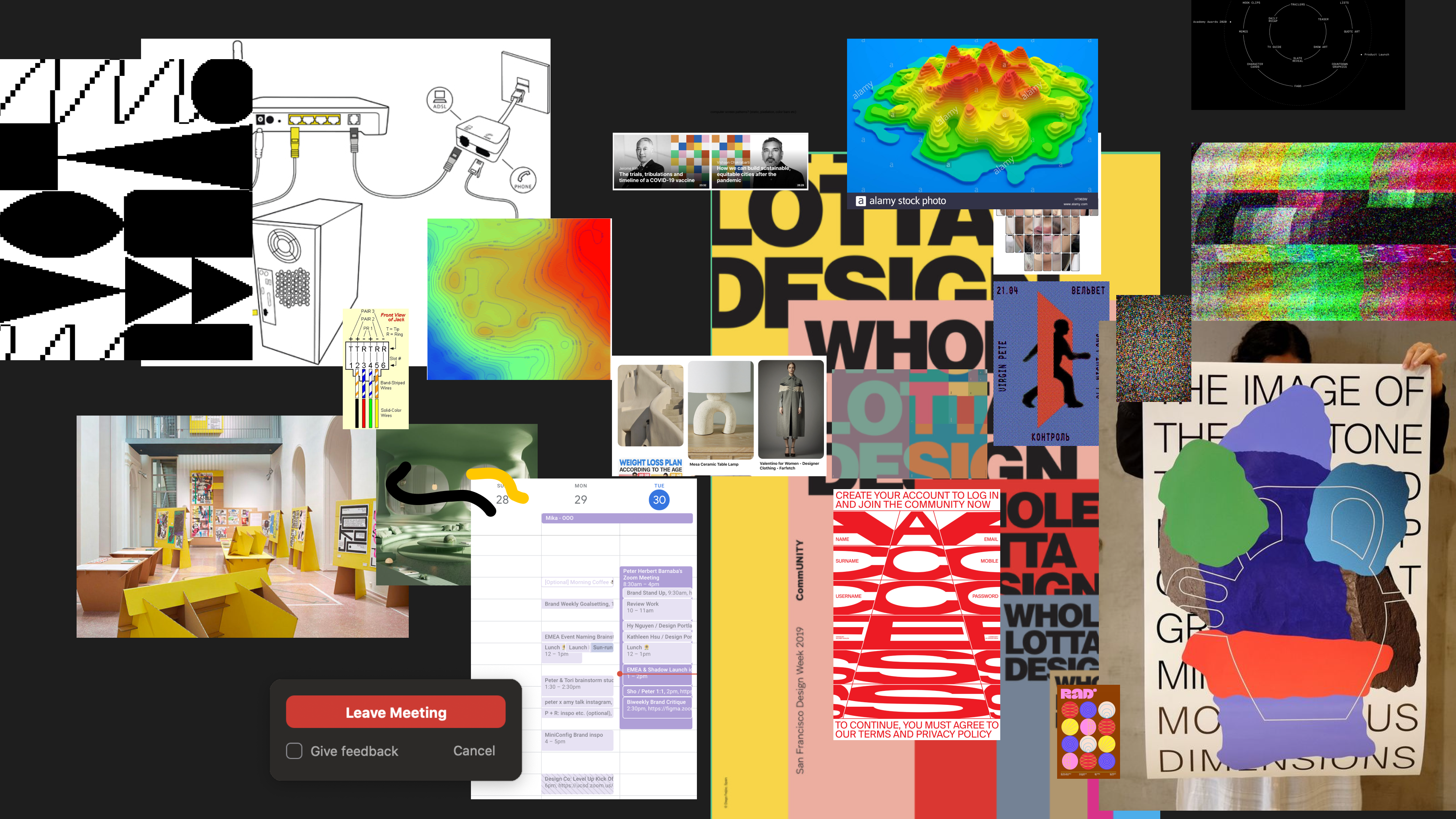
Remilla and I started with mood boards and research, as one should. We’ve never designed for a digital conference before so we wanted to look at what other conferences were doing.
This included considering international design since our audience wasn’t all American. And if you know global design you know they’re a lot more liberal with color, type, and form; so we had to step outside of our brand comfort zone.
Since it was an online design conference, we decided to do something with a more technical look. Not technical as in definitively complex, but technical in its appearance. Computer-like. Digital.
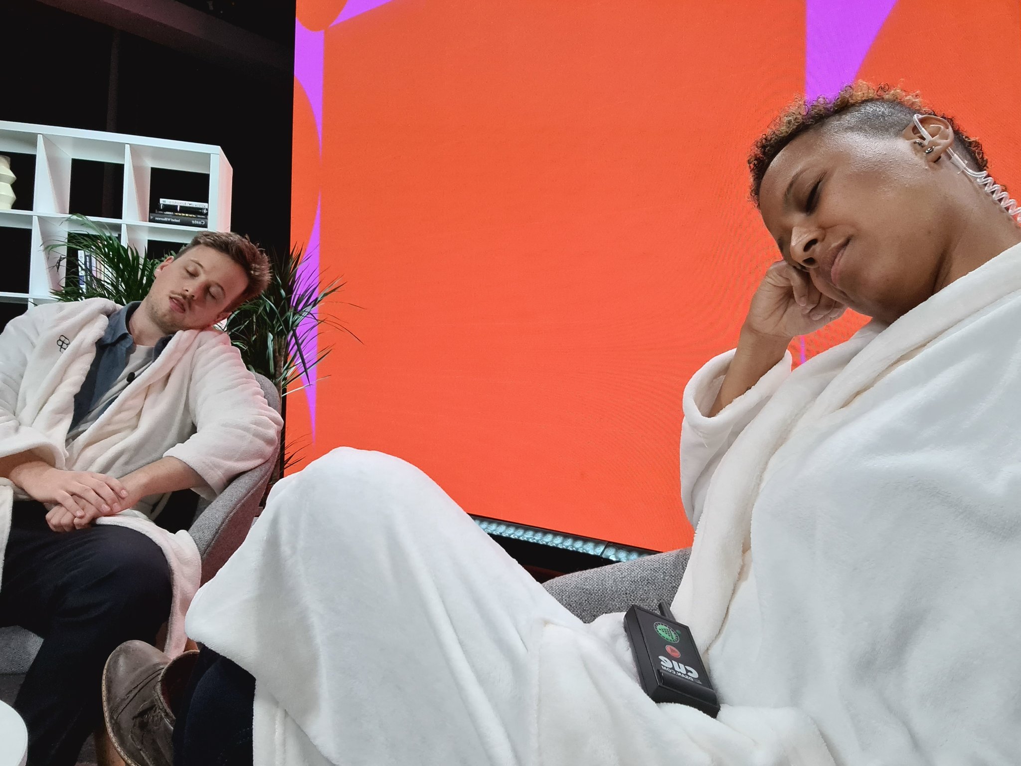
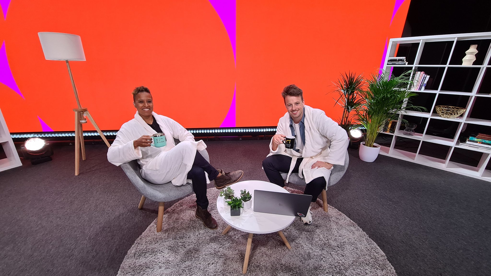
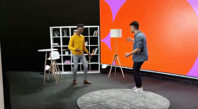
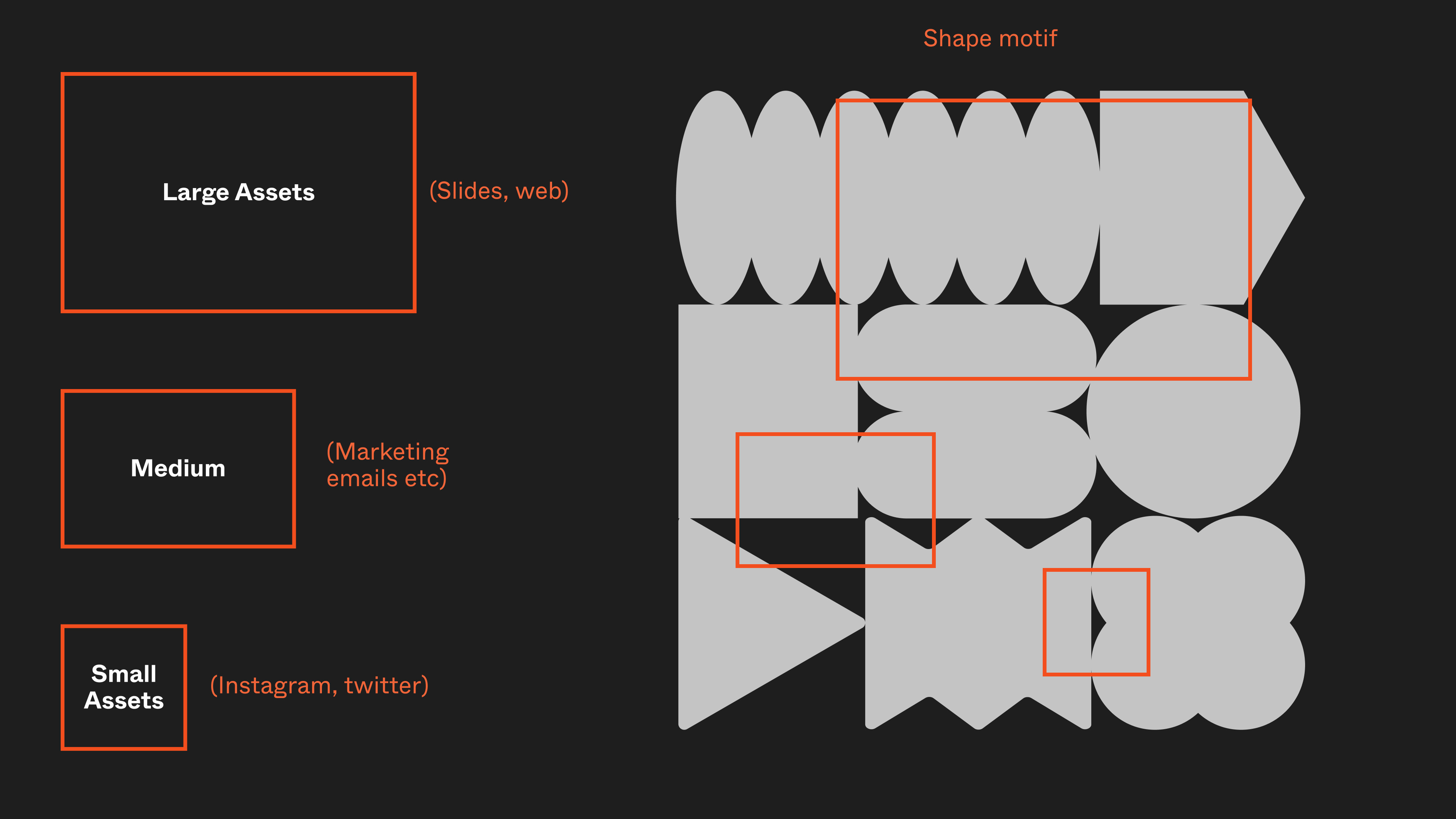
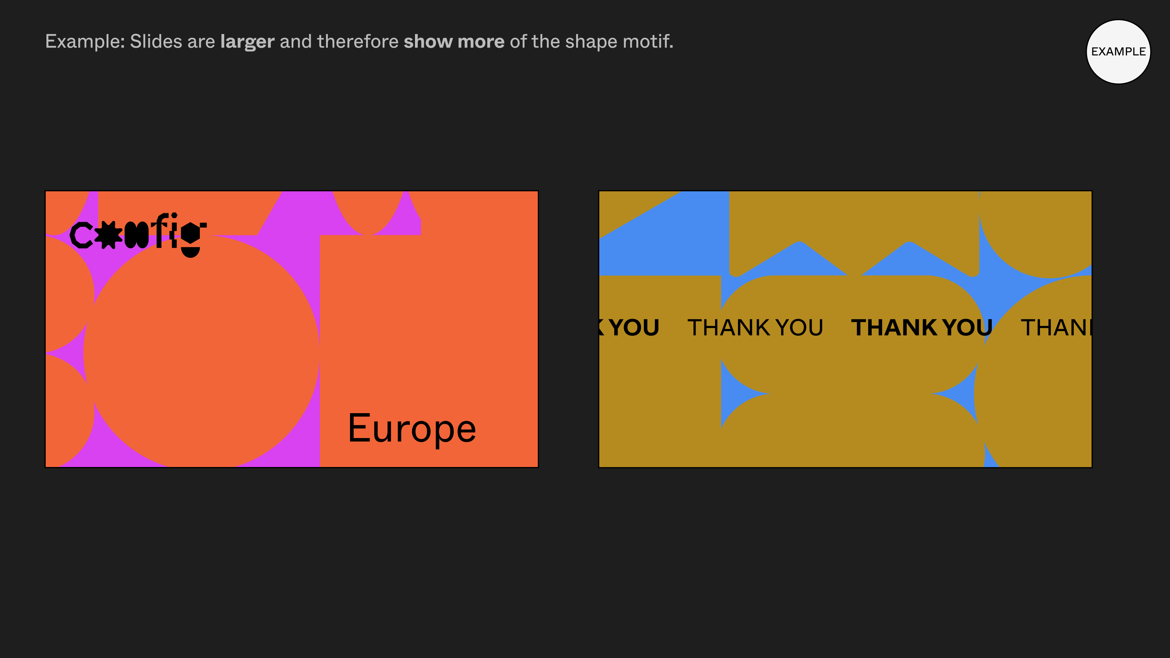
So we came with this “Behind The Screen” idea where we blew up the shapes and made them into a motif. At the IRL Config, the venue and stage were decorated in these larger-than-life cutouts of the shapes from the branding.
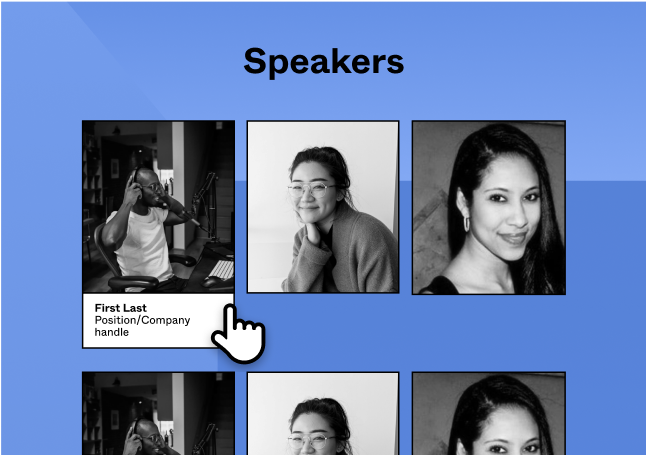
We thought it’d be cool to use that point of view: what did the speakers see when they were up there?
Can we replicate a behind-the-scene from a digital point of view? What do colors look like inside a monitor? Behind the actual screen? A lot of those questions influenced the directions and colors of the brand for Config EU, which you’ll see below.

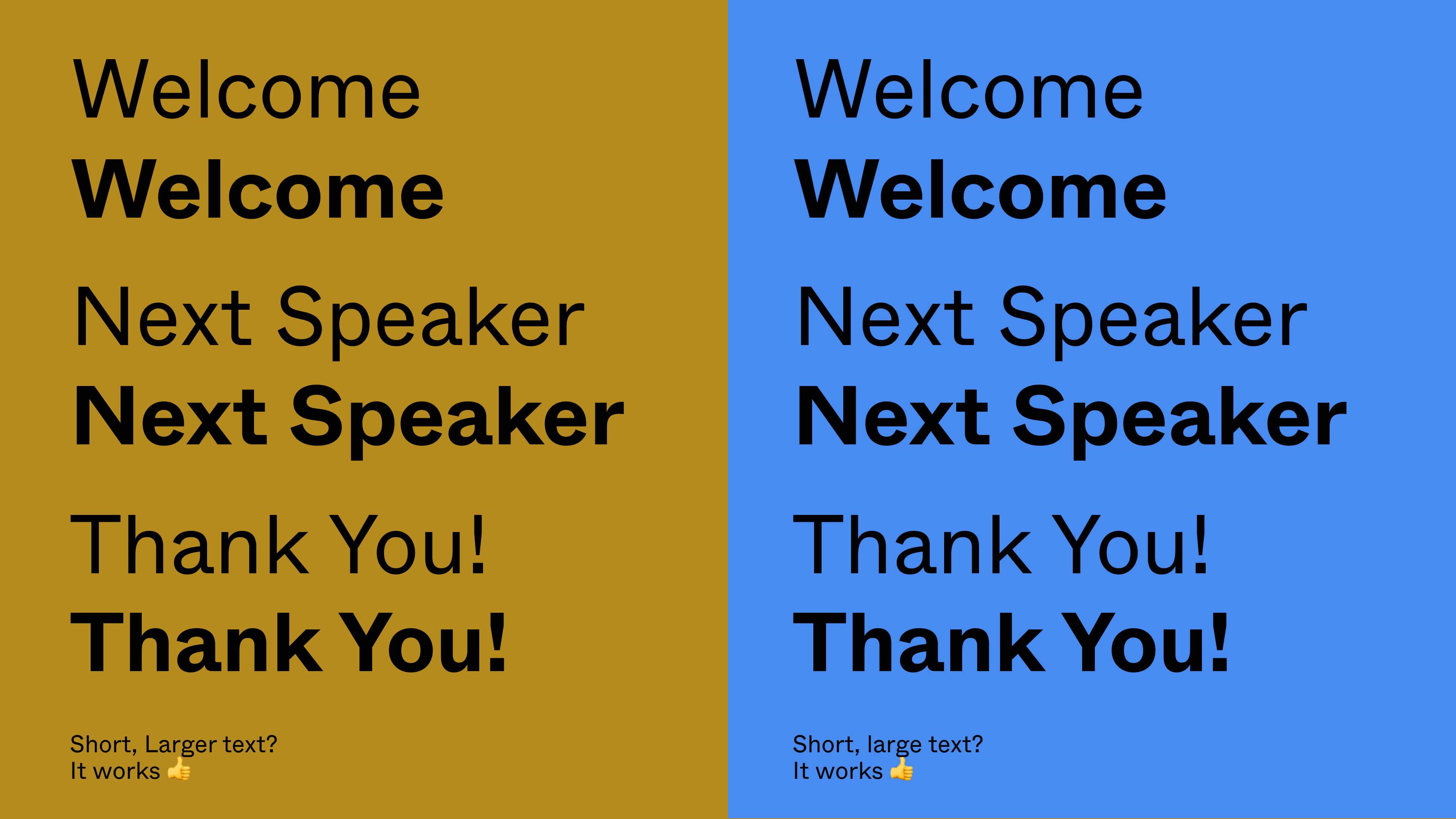
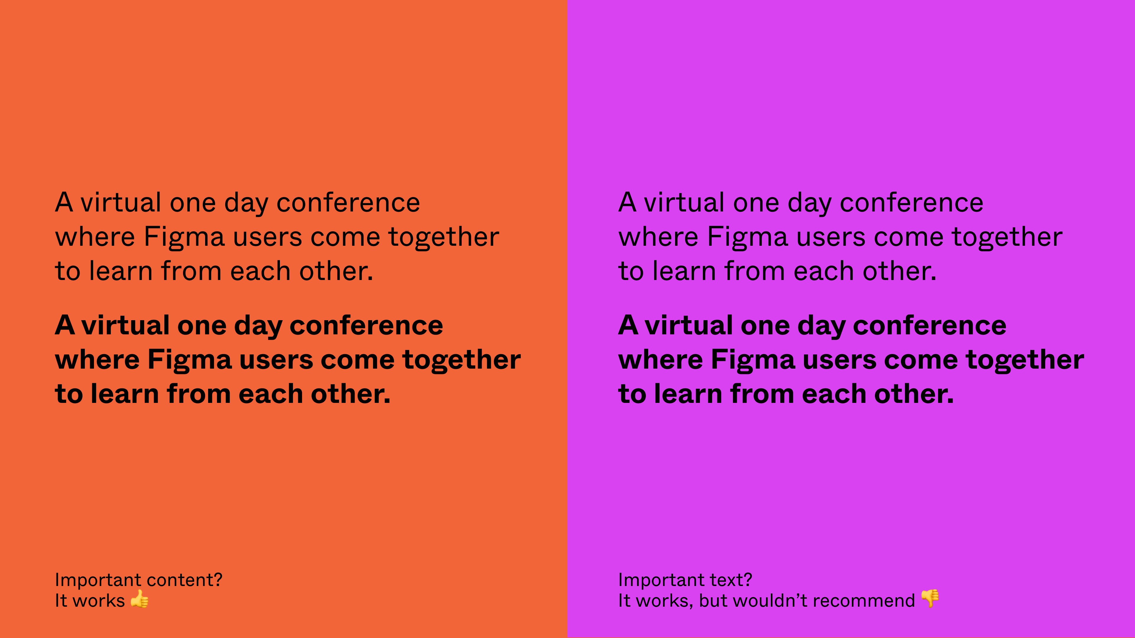
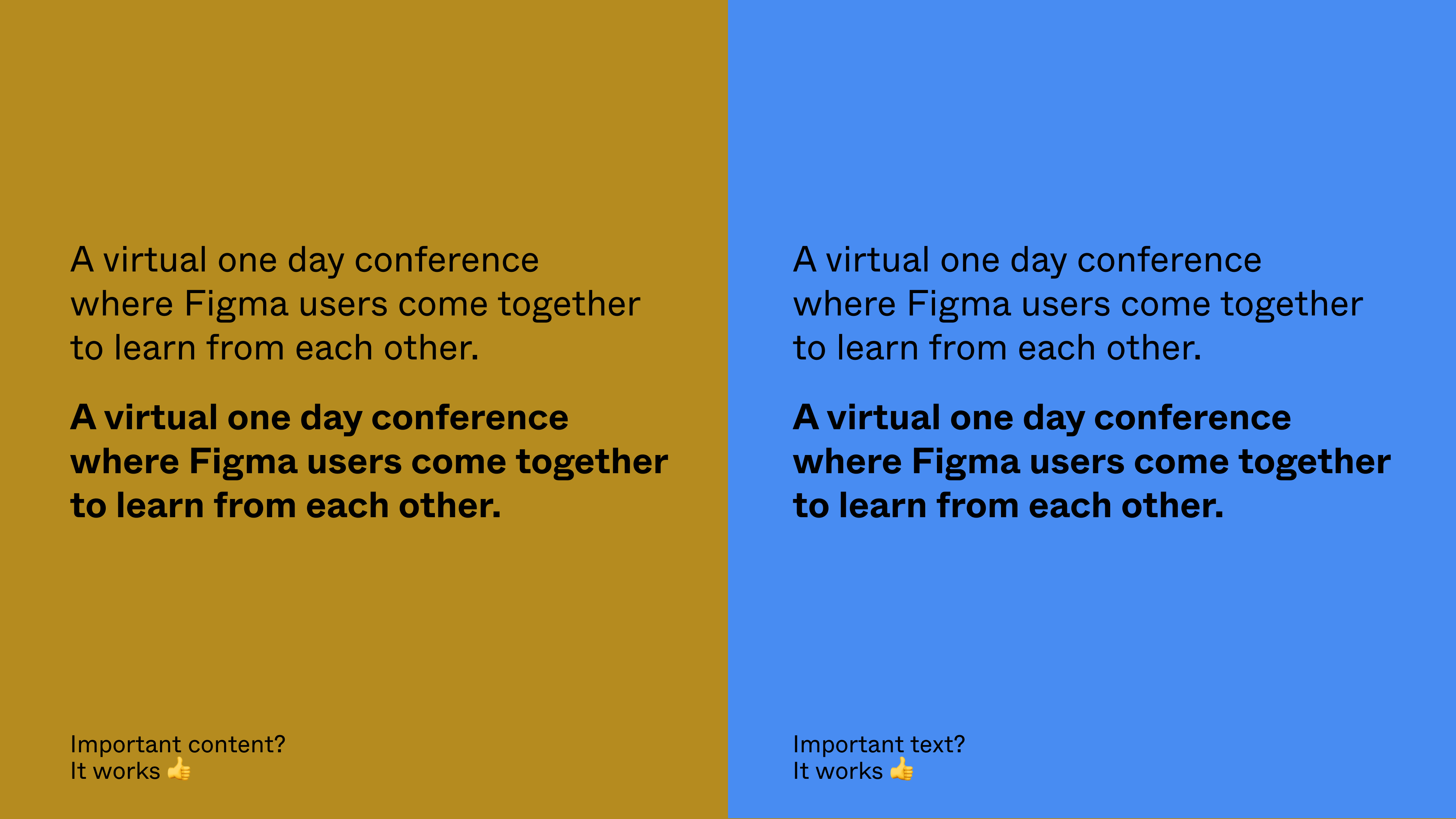
Iterations


Final Style Guide & Application
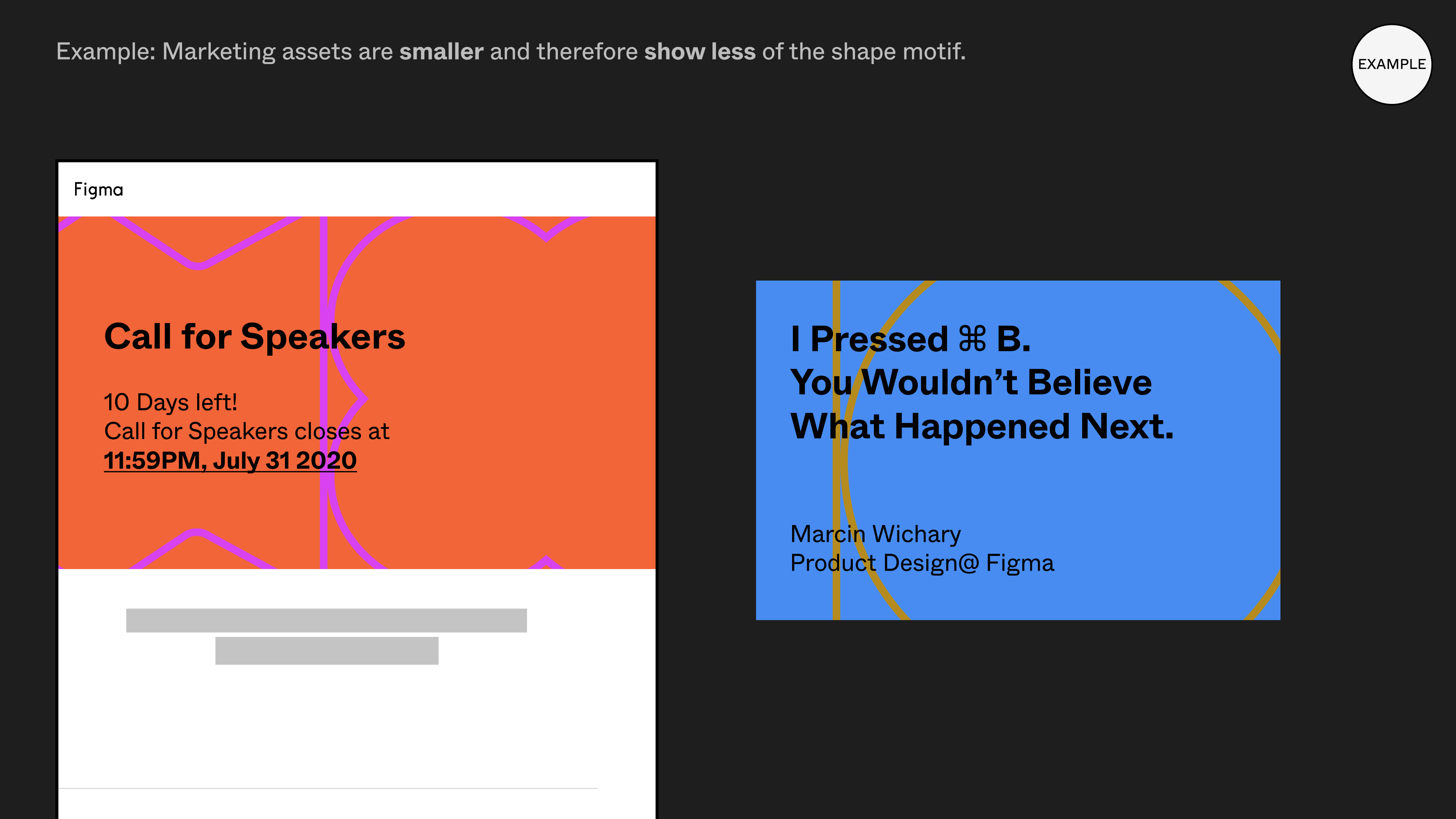
After rounds of crit and refinement (and a tight deadline), here is where we landed. The colors were eye-catching and different but still worked on the web.
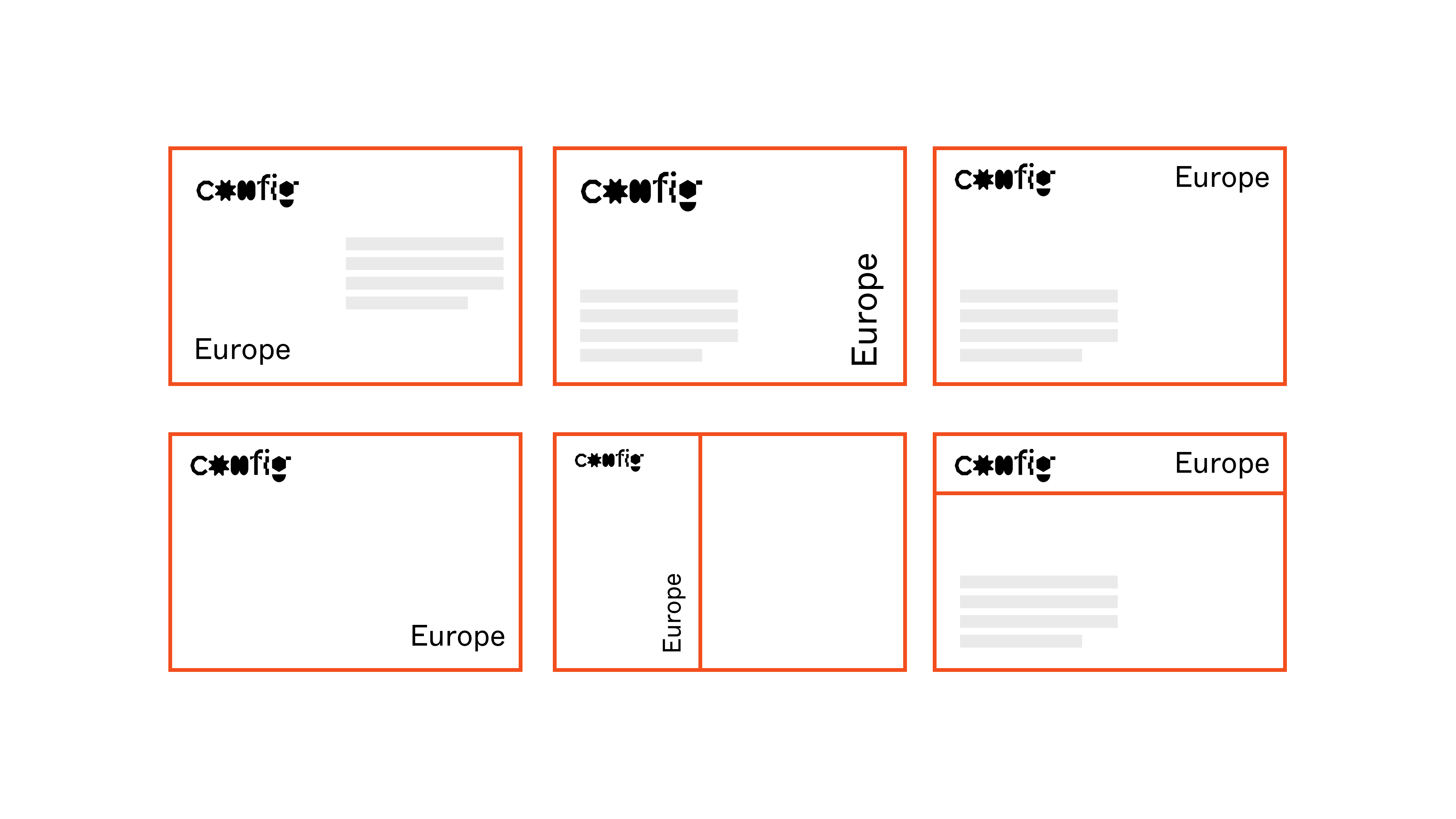
We maintained a level of consistency that carried through from the previous Config brand and came up with a system that was easy to implement and roll out to speakers as well as other designers who needed to build assets from it.

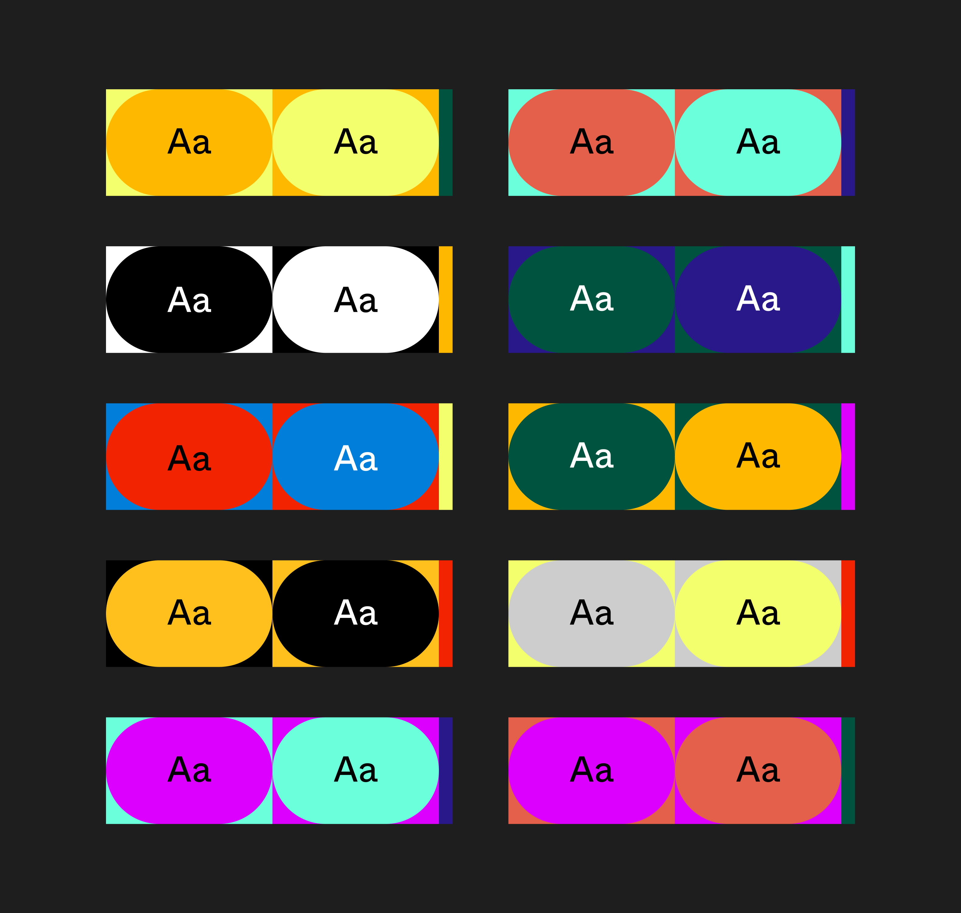
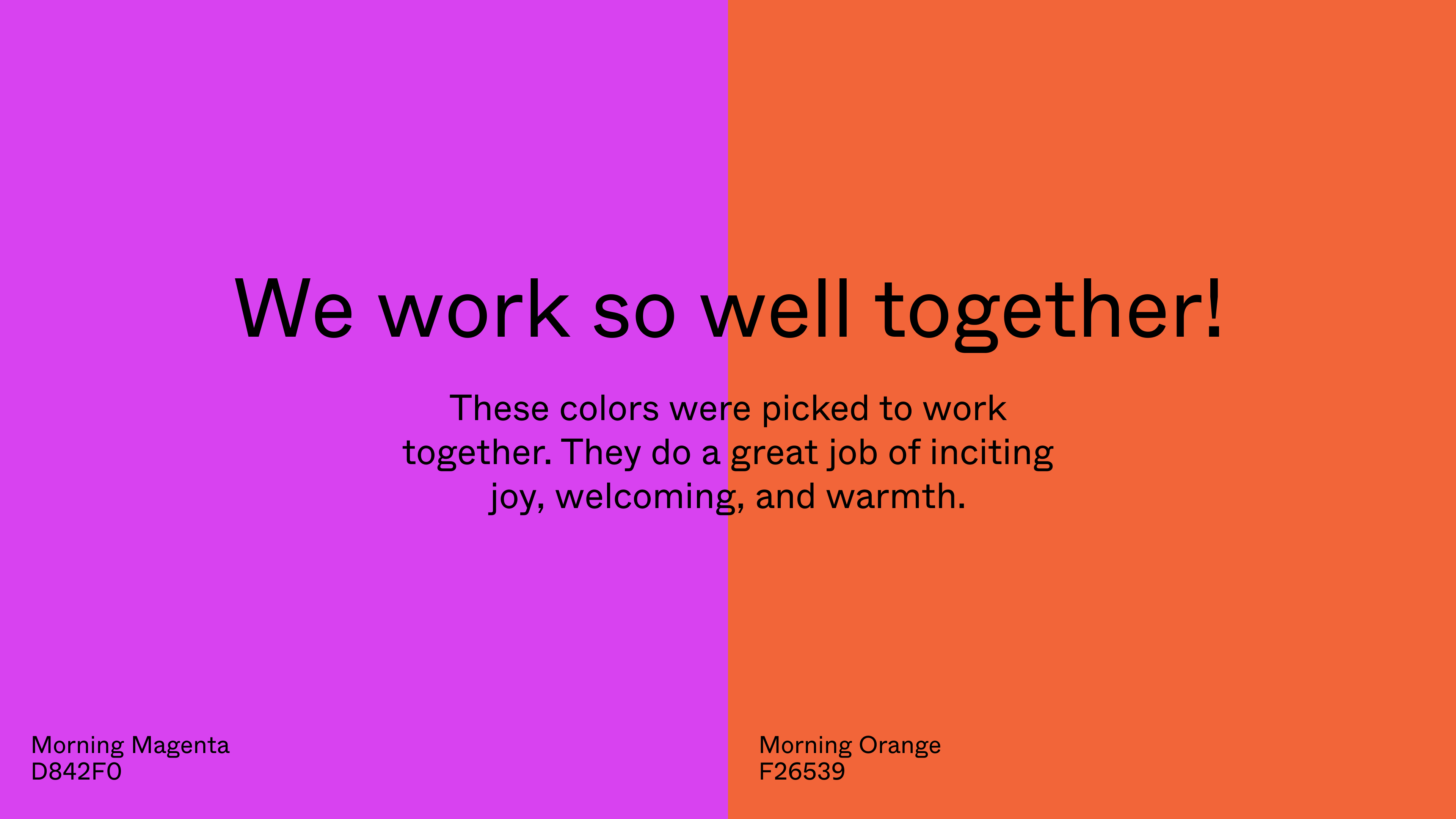
Color Palette


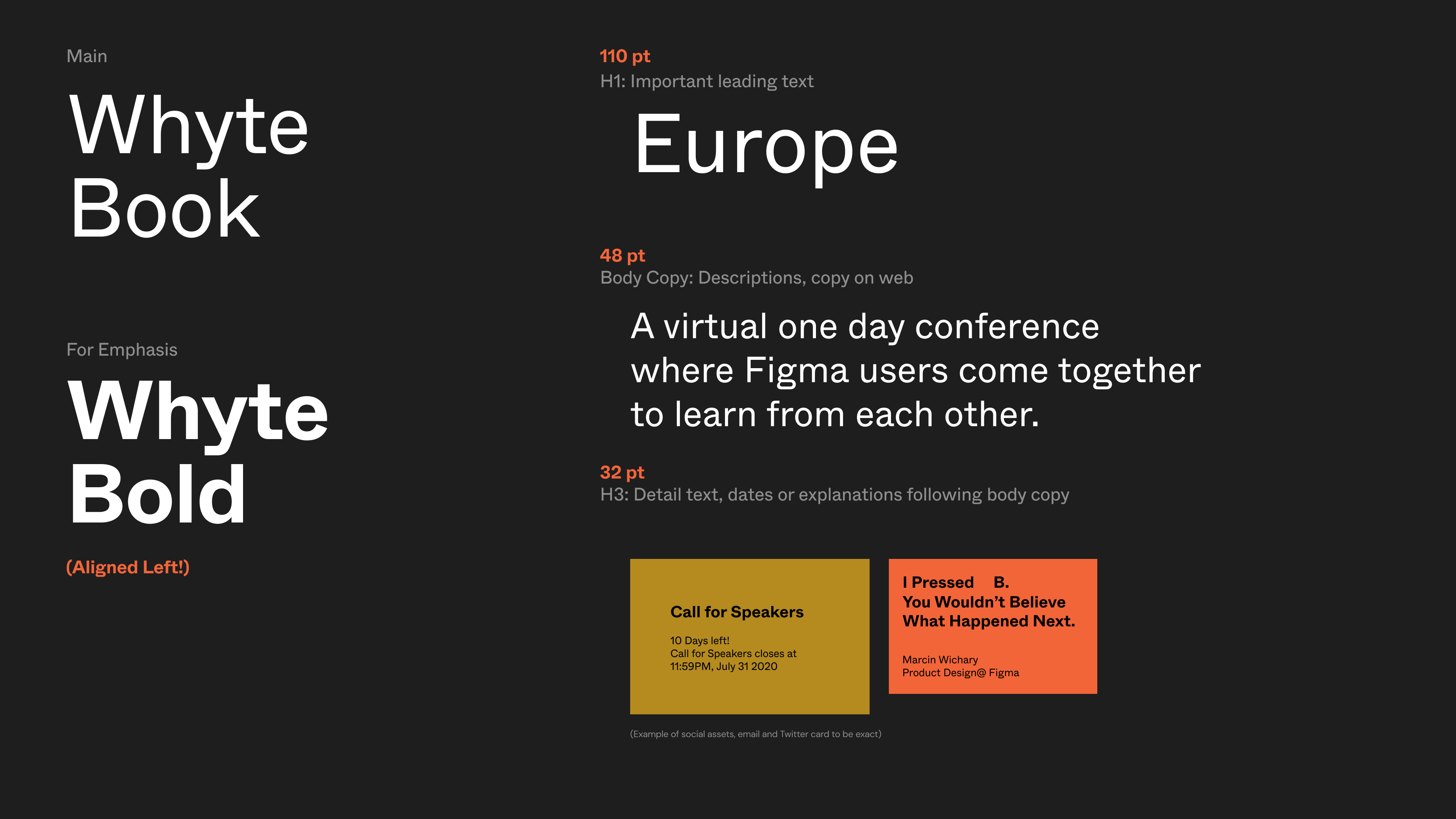
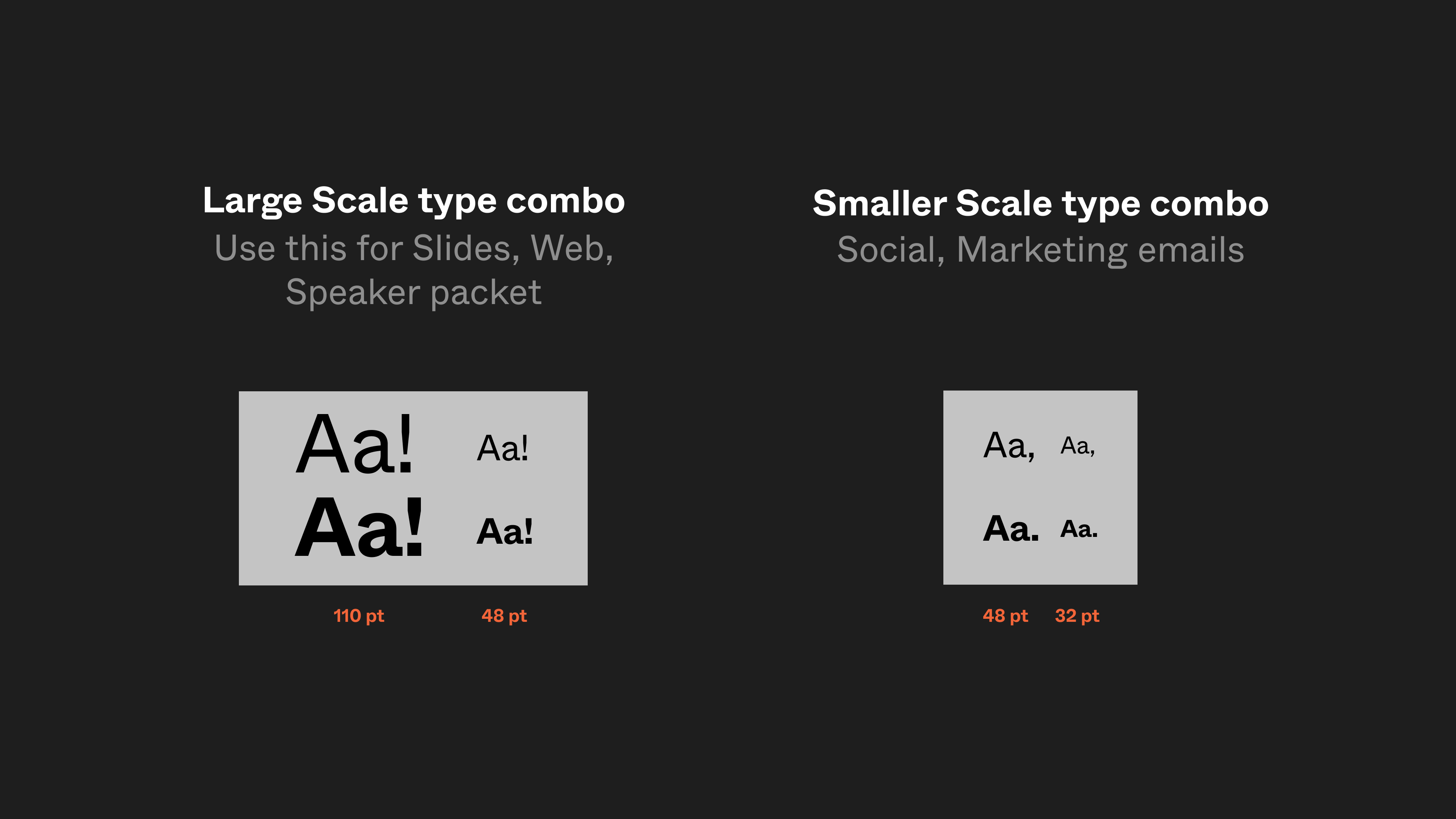
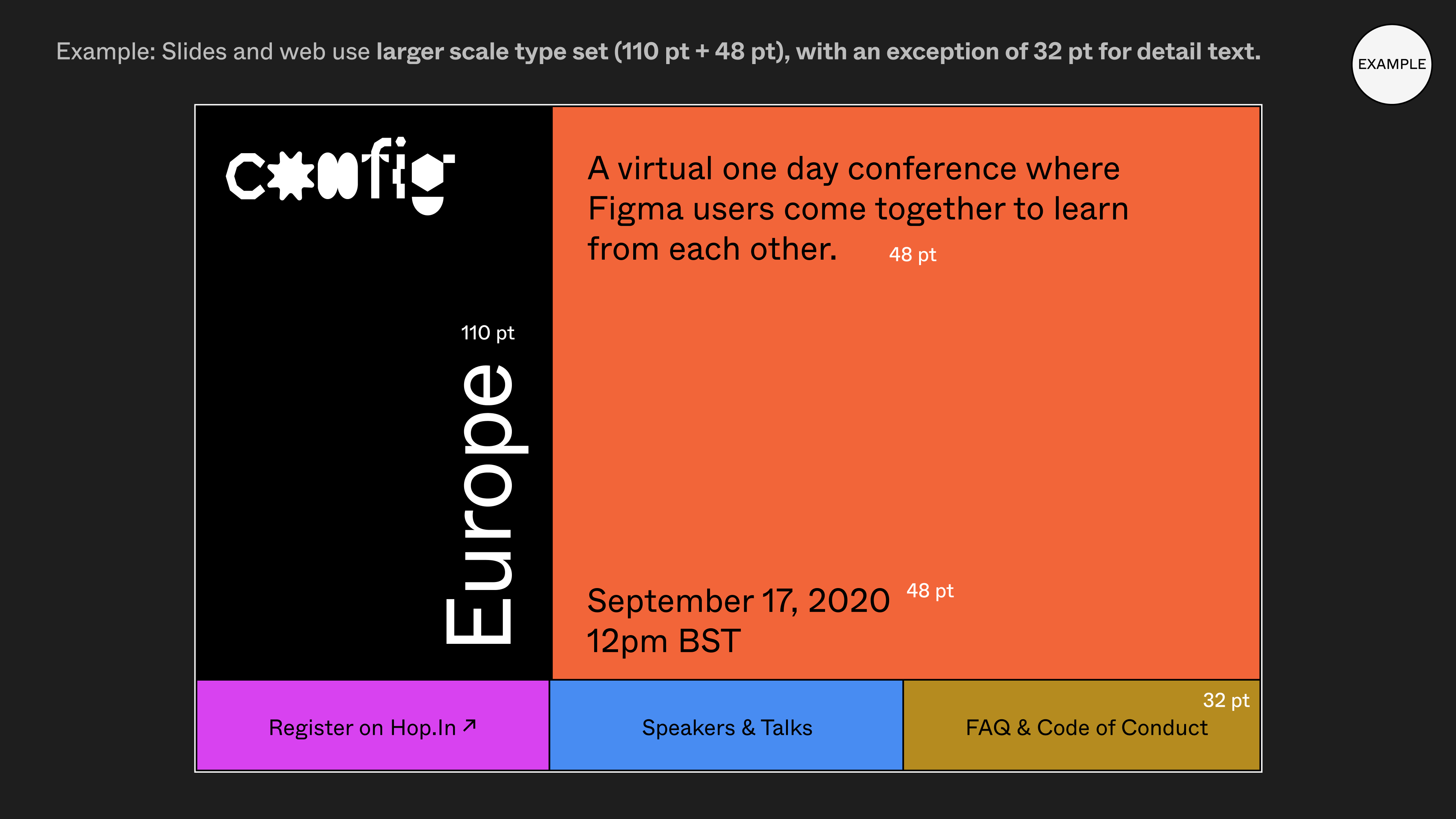
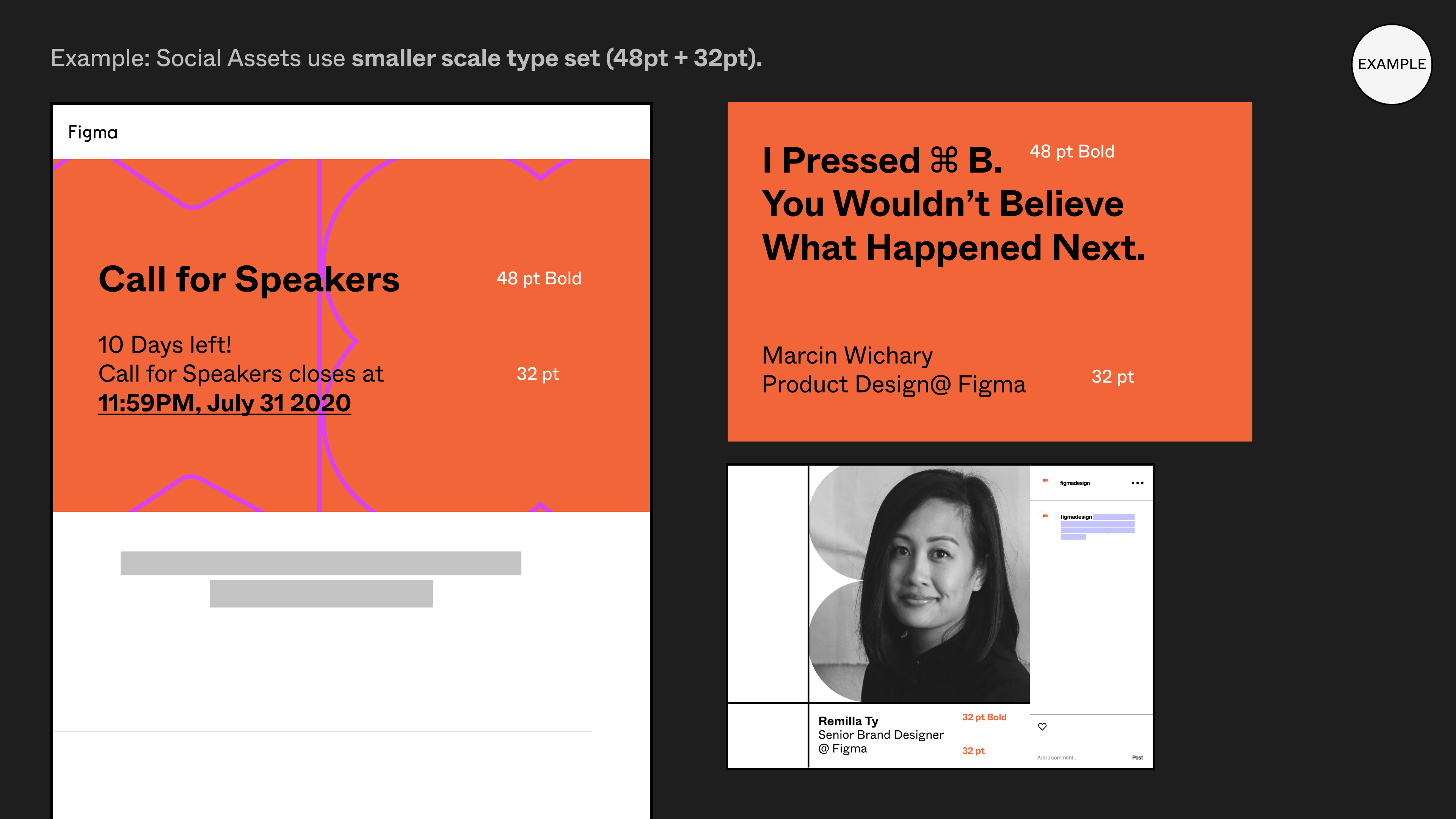
Typography and Application

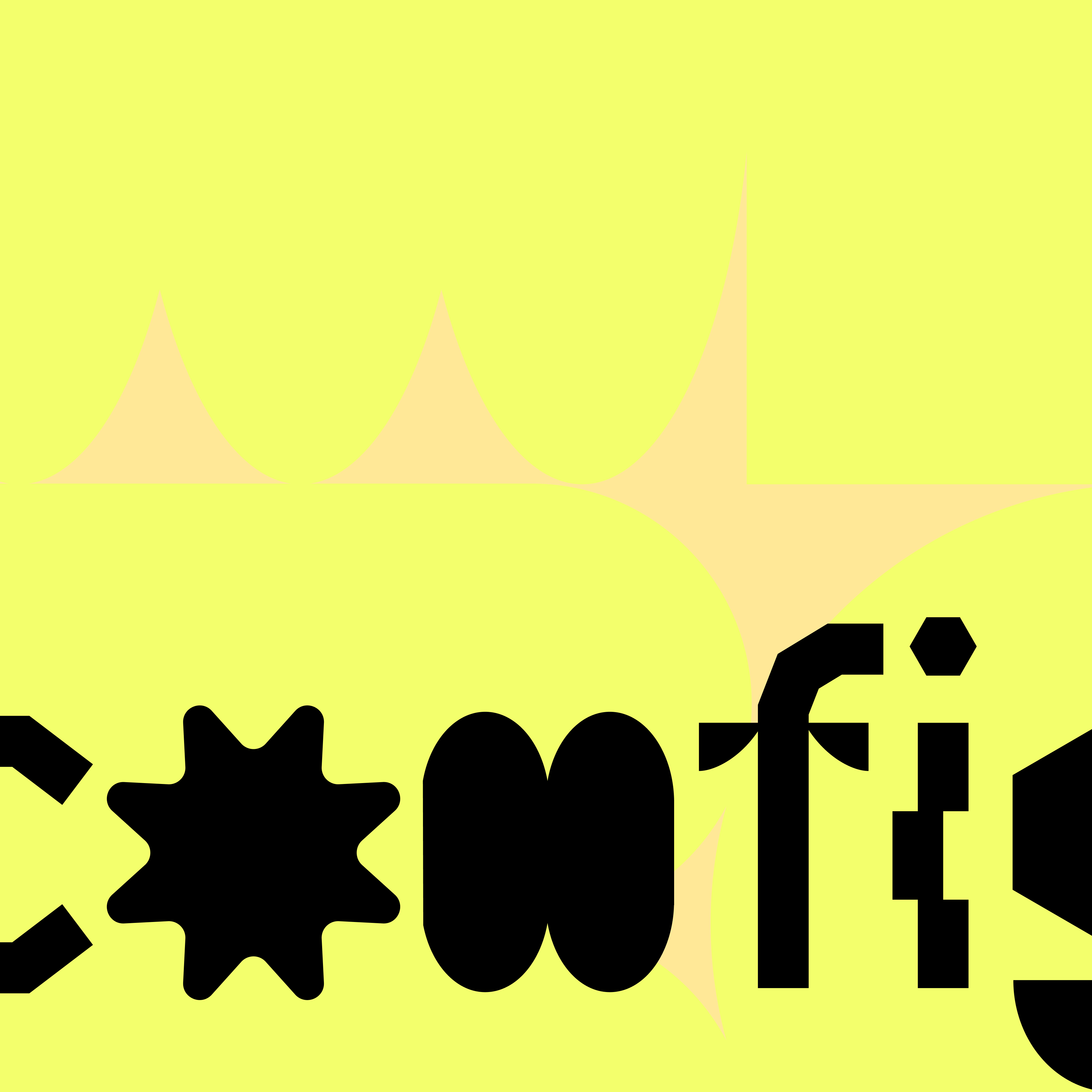
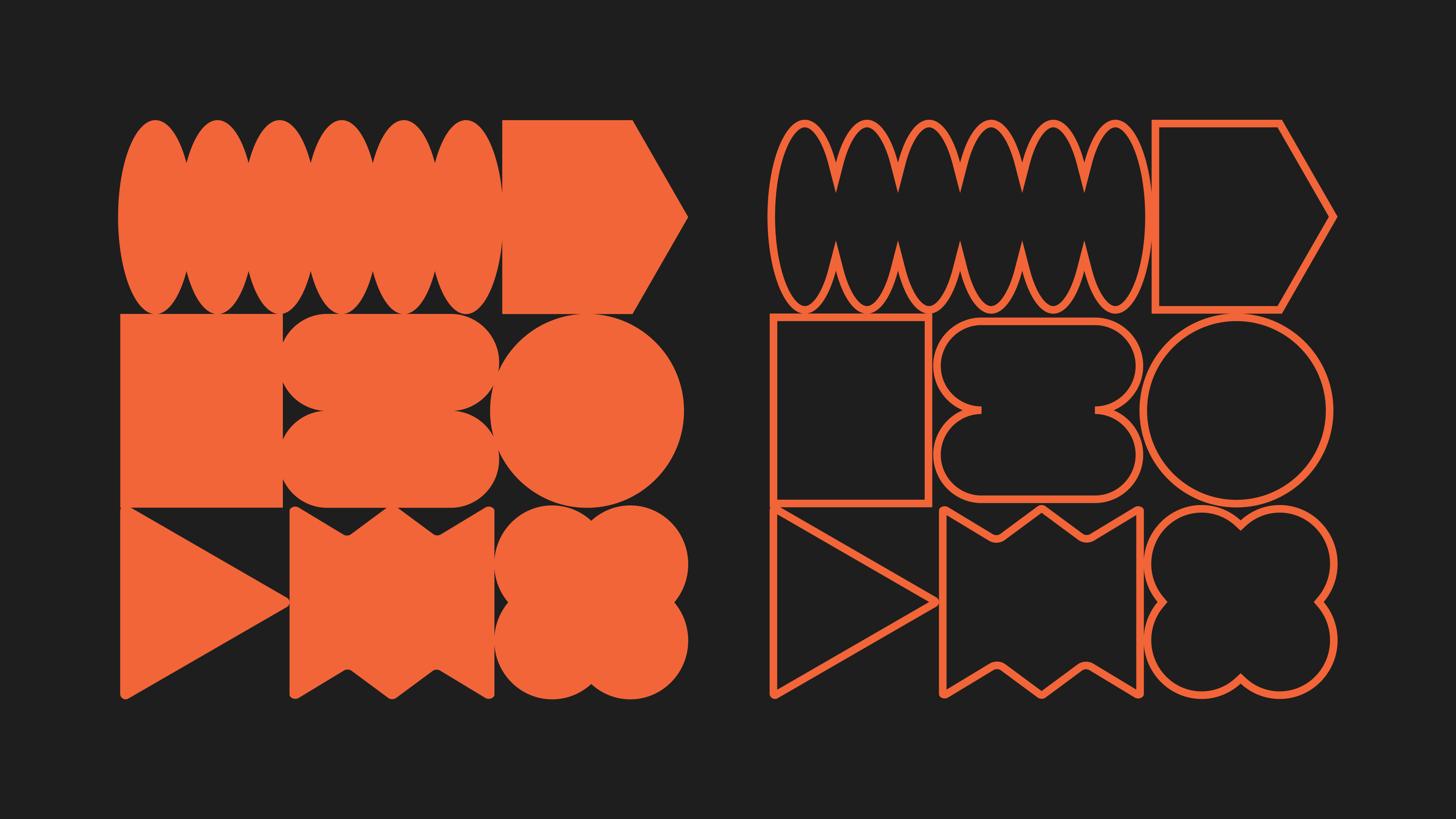
Shape Vignette
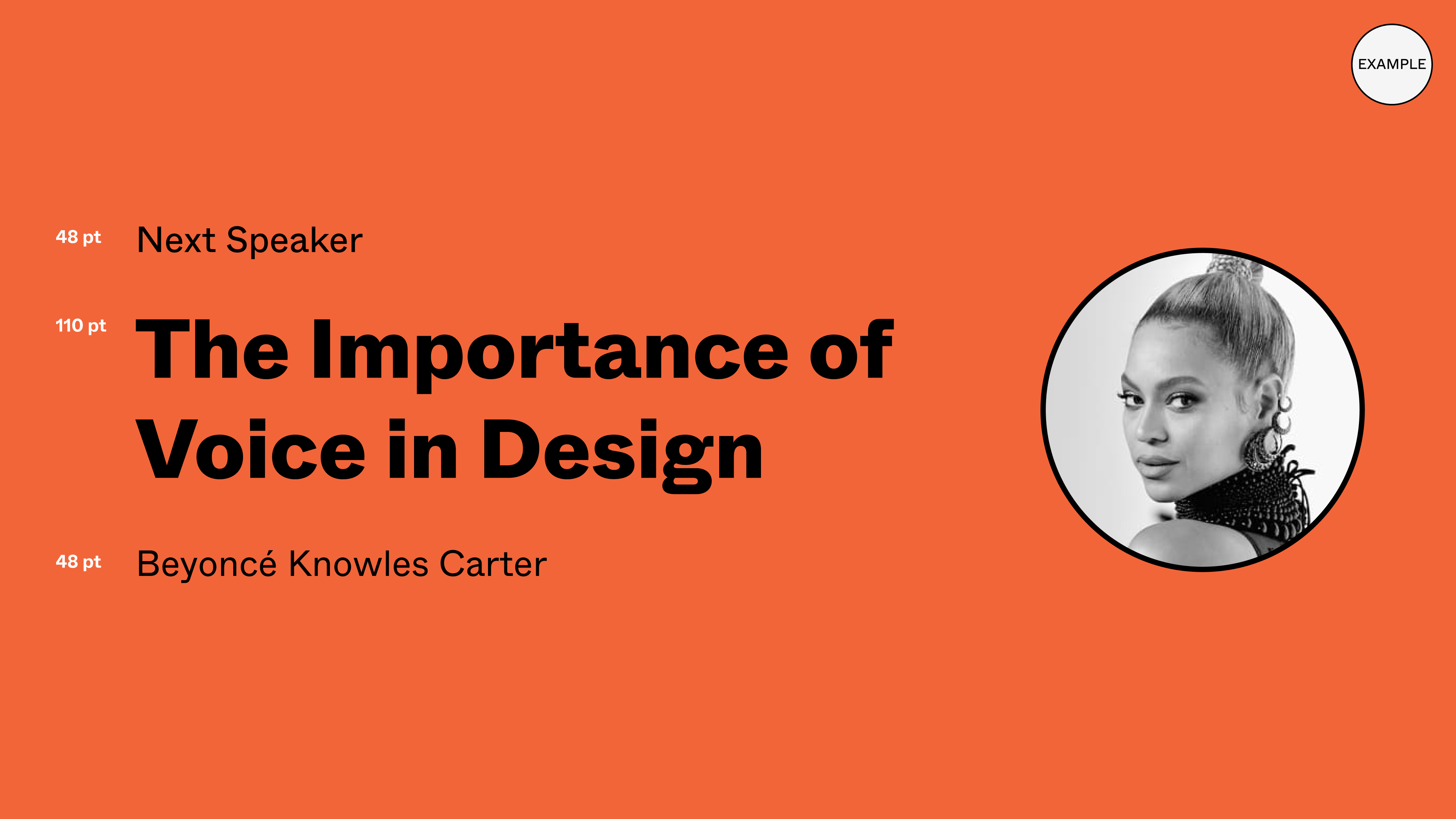
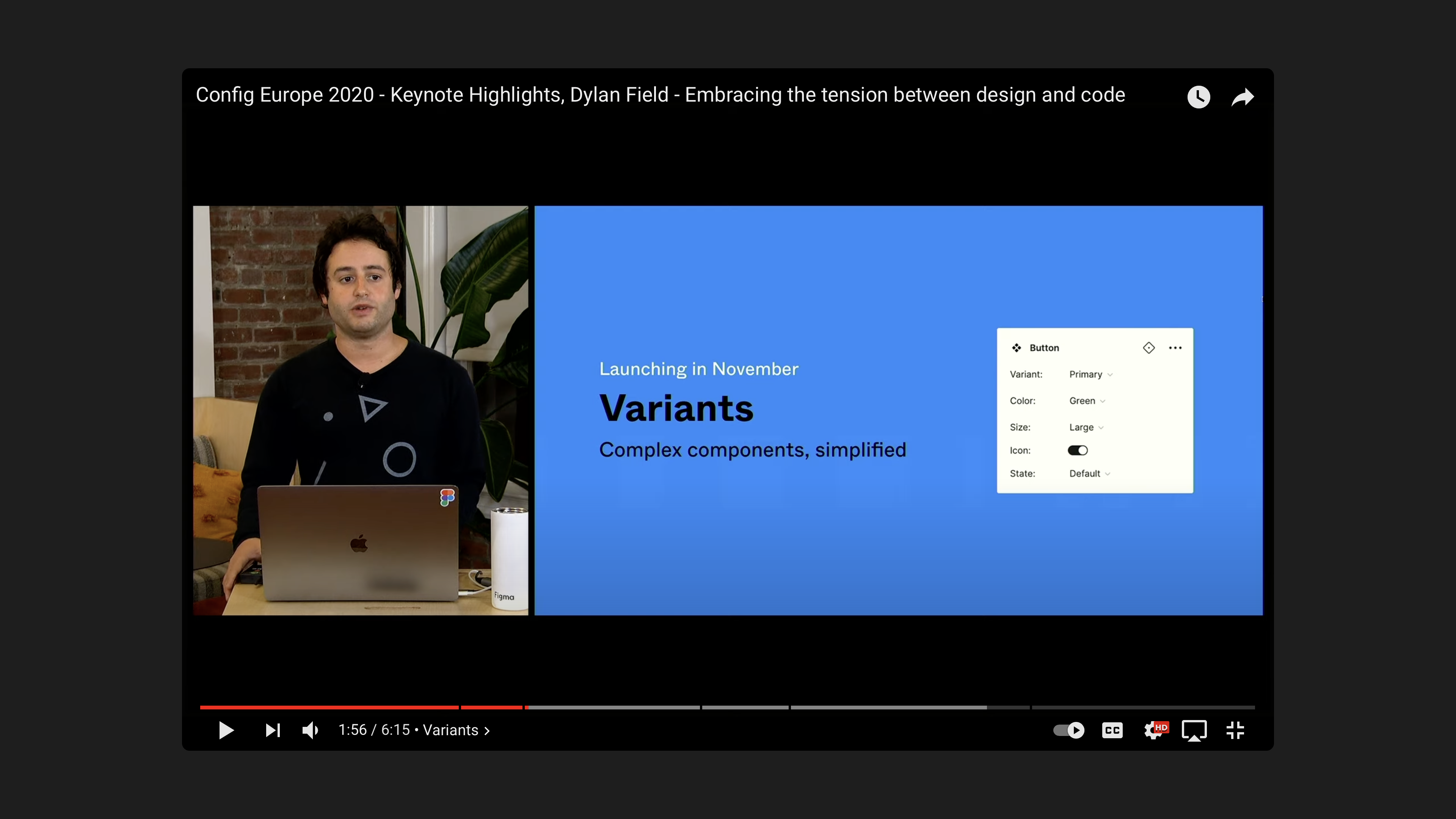
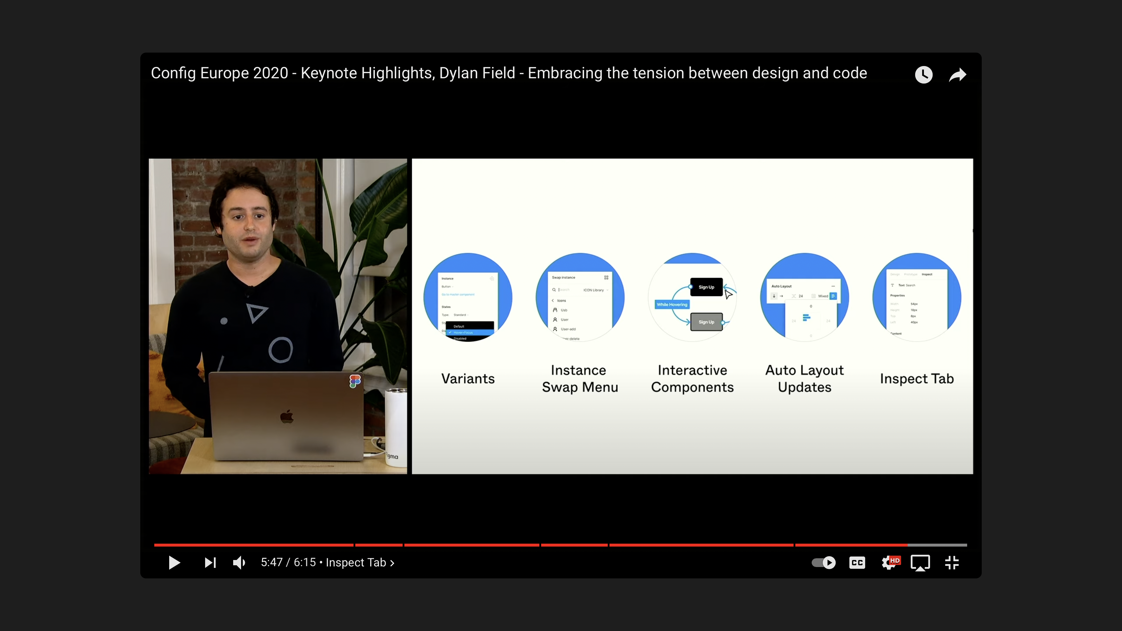
Keynote and Application

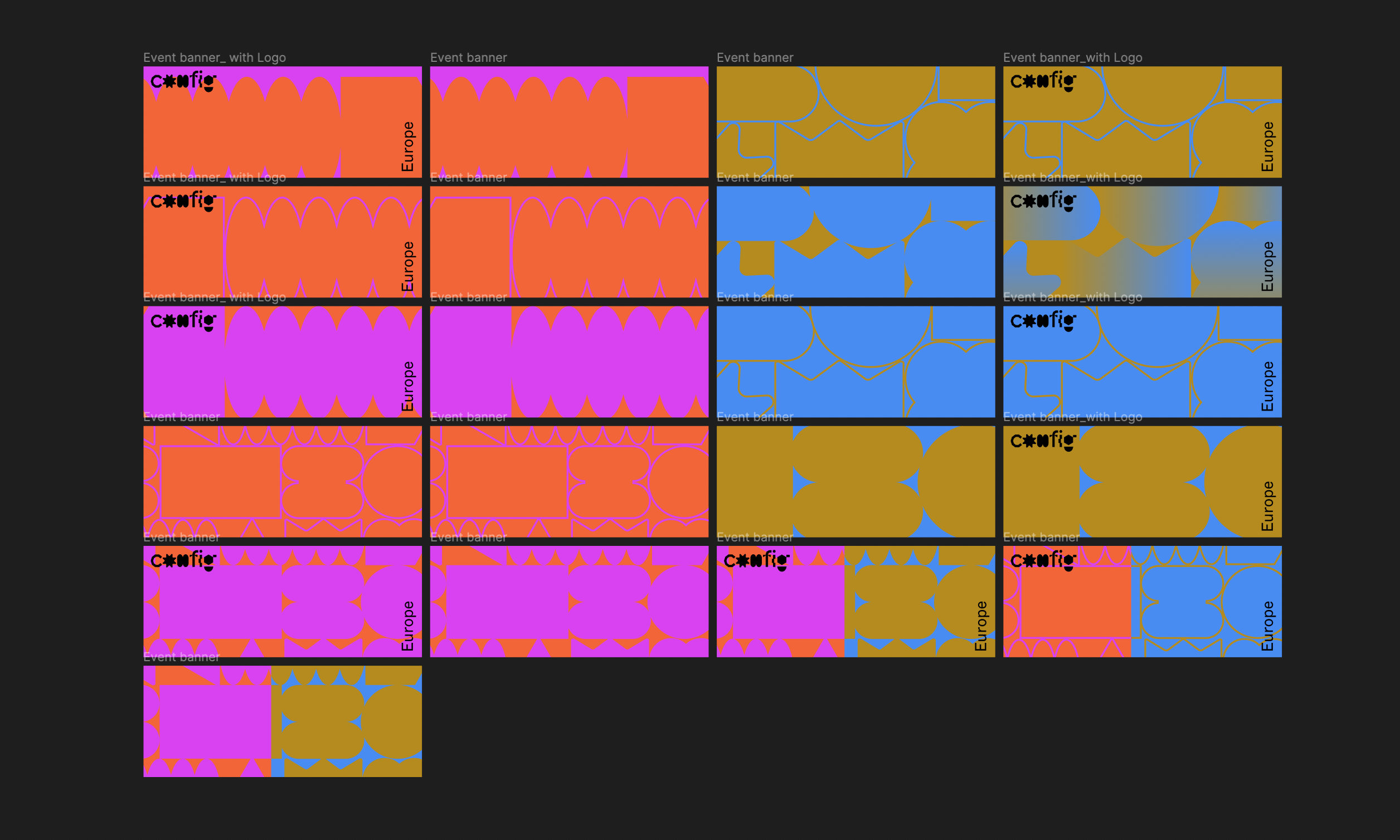
Platform Assets
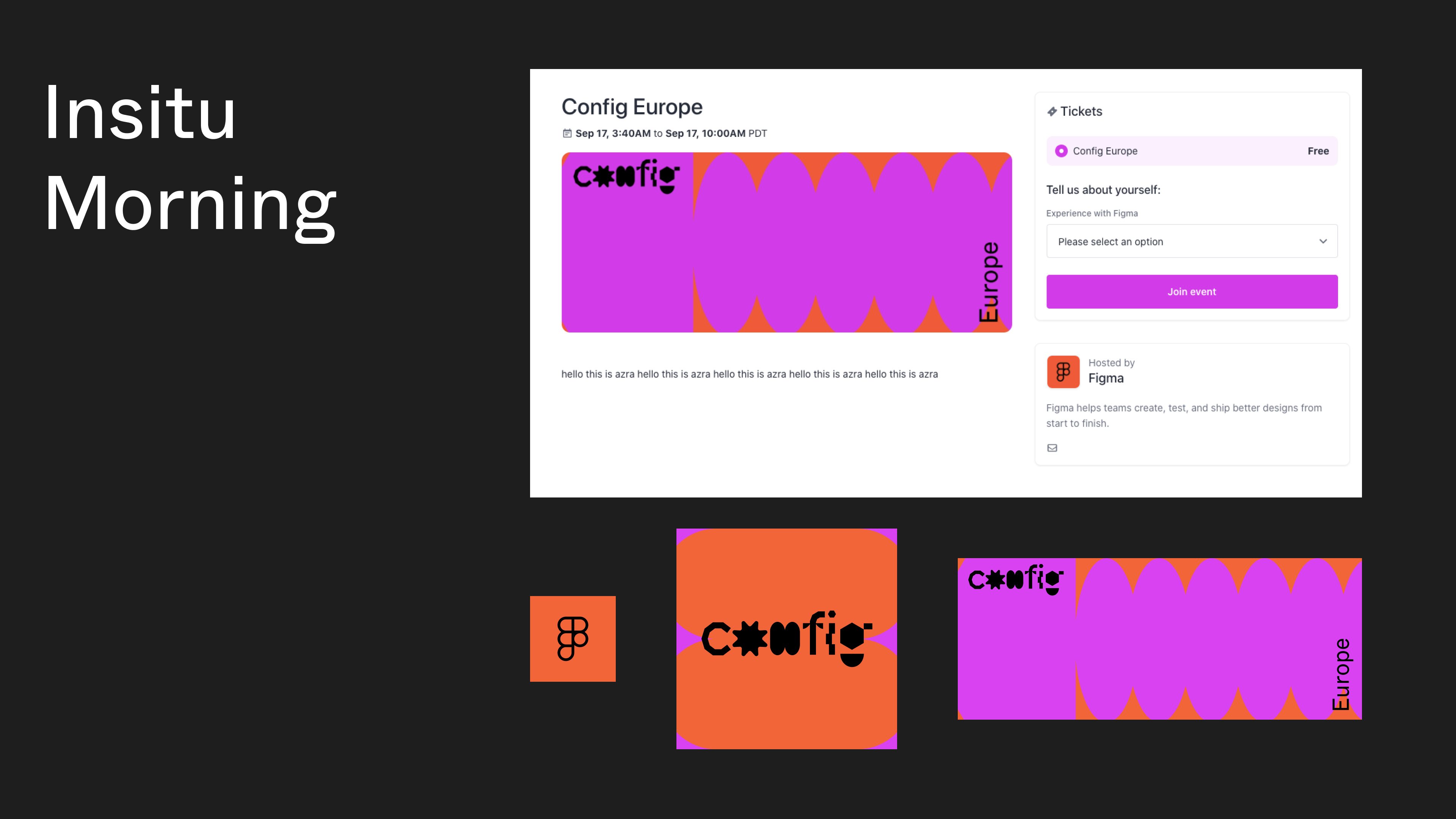
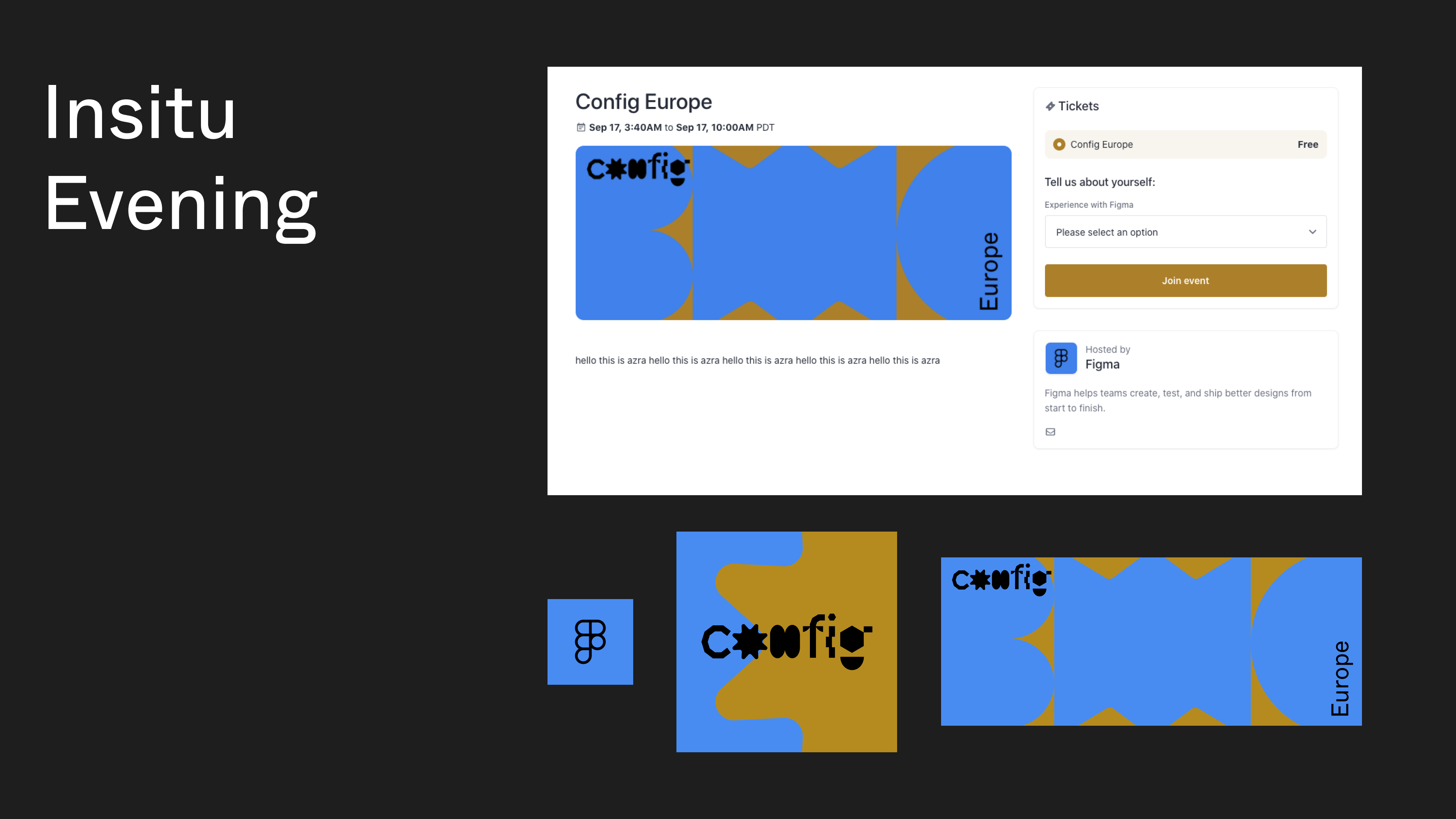

Event Page
Designed and put together by Catherine Bui and Corey Ward.

And, Scene!
So much work went into Config EU in such a short amount of time. Please do come to the next one, it was an enjoyable, light-hearted event that was touching, funny, and relatable.
Thank you to Azra, Claire, Corey, Tori, Remilla, Dylan, Mika, Andrea the whole product and engineering team, for making this event a success. It was a cross-functional effort that involved the likes of marketing, producers, writers, product-support, dev and motion design contractors.